The app that failed the people who needed it most.

An NHS public health app — 22 usability issues across 10 heuristics, one rated catastrophic. Six weeks, zero budget, WCAG 2.1 AA non-negotiable.

UX EvaluationAccessibility
The app that failed the people who needed it most.

The app that failed the people who needed it most.

An NHS public health app — 22 usability issues across 10 heuristics, one rated catastrophic. Six weeks, zero budget, WCAG 2.1 AA non-negotiable.

UX EvaluationAccessibility
The app that failed the people who needed it most.

The app that failed the people who needed it most.

An NHS public health app — 22 usability issues across 10 heuristics, one rated catastrophic. Six weeks, zero budget, WCAG 2.1 AA non-negotiable.

The app that failed the people who needed it most.

The app that failed the people who needed it most.

An NHS public health app — 22 usability issues across 10 heuristics, one rated catastrophic. Six weeks, zero budget, WCAG 2.1 AA non-negotiable.

UX EvaluationAccessibility
The app that failed the people who needed it most.

PROJECT OVERVIEW

PROJECT OVERVIEW

PROJECT OVERVIEW

A live NHS public health app, and one question: why couldn't parents act on what they scanned?

From a live NHS public health app to a redesigned behaviour-change platform in six weeks. Every decision grounded in heuristic evidence, constrained by zero budget, and evaluated against WCAG 2.1 AA compliance for a vulnerable user base.

From a live NHS public health app to a redesigned behaviour-change platform in six weeks. Every decision grounded in heuristic evidence, constrained by zero budget, and evaluated against WCAG 2.1 AA compliance for a vulnerable user base.

Team

1 UX designer (me)

3-evaluator heuristic panel

6 Think Aloud participants

My Role

Heuristic evaluation

Think Aloud testing

Figma redesign and WCAG audit

Timeline

6 weeks · 2024

85%
Feature discovery
Up from 40% in Think Aloud baseline — the behaviour-change feature is now the second tap from home.
{ Discoverability }
100%
Screen reader completion
Up from 0% on the original scanner — every user can now confirm a scan through three feedback channels.
{ Accessibility }
40%
Faster food entry
Average entry time fell from 4.2 minutes to 2.5; the step-4 drop-off was eliminated.
{ Efficiency }
Sev 4
One catastrophic issue
The only finding of 22 to receive Nielsen's highest severity rating — a systematic public-health risk in the core guidance layer.
{ Heuristic evaluation }

THE CHALLENGE

THE CHALLENGE

The existing market wasn't failing to show nutritional data. It was failing to make it mean anything.

The NHS Food Scanner existed inside a market with three compounding failures — all rooted in treating nutritional data as the end point, not the starting point, of a health decision.

App store reviews for family nutrition apps consistently cite "confusing results" and "no clear next step" among the most common reasons for uninstalling.

1 in 3
Children overweight by age 11
Leave primary school overweight or obese — a 40% rise over the past decade.
{ Public health crisis }
89%
App abandonment in two weeks
The industry retention benchmark for food and nutrition apps.
{ Ineffective UX }
2.2 / 5
Nutritional literacy score
Across public-health digital tools that present data without a guidance architecture.
{ Cognitive gap }

{01} — Problem

The app had the data. It never gave users a verdict.

When a food scanned as "Good Choice", users trusted it. Ultra-processed products — high in additives, low in genuine nutritional value — received the same endorsement badge as genuinely healthy alternatives. Users didn't fail to read the screen; the screen gave them the wrong answer. The app had accurate data. It lacked a guidance architecture capable of translating that data into a decision.

The act of being watched created a counter-motivation to subvert the system.
Teens felt accused, not supported, and found workarounds within days of installation.

Sev 4
Catastrophic severity
The only issue of 22 findings to receive Nielsen's highest rating — a systematic public-health risk embedded in the app's core guidance layer, not a minor inaccuracy.
{ Nielsen (1994) severity scale }
Punishment is the only response
Homework requires photographic proof

{02} — Problem

Every scan led to a dead end. The feature that could change behaviour was invisible.

The app's most powerful feature — Smart Swaps, which suggested healthier alternatives to a scanned product — was hidden behind a secondary scroll. The scanner itself sat behind the drawer menu, three taps from the home screen. Information architecture across four navigation levels created cognitive overhead at the exact moment users had a product in hand and seconds to decide.

3 taps
From home to the scanner
The app's primary function sat three taps deep. A navigation structure that treats its core action as a third-level feature is a structural failure, not a labelling problem.
{ Observable by anyone }
3 bypass methods ; 83 minutes
The workaround worked

{03} — Problem

The scanner worked every time. For screen reader users, it had never worked once.
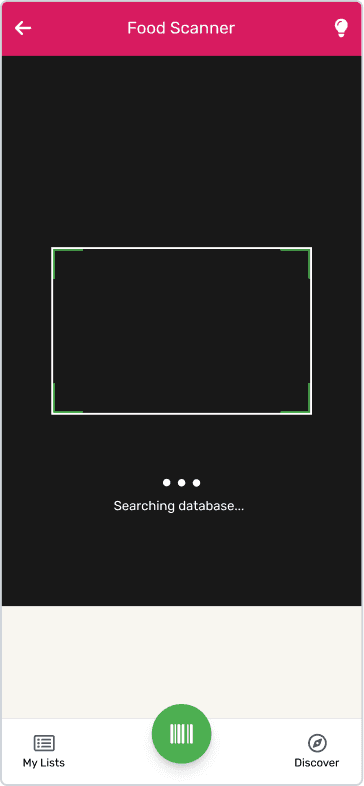
The scanner returned results silently — no state change during capture, no confirmation that a barcode had been detected. For users relying on screen readers, the scanner was non-functional: gesture interactions had no accessibility labels. For an NHS public health tool, WCAG 2.1 AA compliance is not optional — it is the brief.

When gaming time was the reward, self-reporting became a system to game. Rewards became tokens for lying. The product actively incentivised dishonesty through its own design

Sev 3
Major accessibility failure
Error Prevention, Visibility of System Status and Help and Documentation violated at once. Not a single missing label — an architecture never designed with disabled users in mind.
{ Nielsen (1994) severity scale }
4 tasks. 2 minutes

 The strategic breakthrough

Data without interpretation isn't neutral. It's misleading. The app's core promise — healthier choices for families — was undermined by its own label system.

Gaming isn't the enemy of focus; it's the missing motivation bridge.
Every previous solution fought teenage psychology. The opportunity was to work with it.

RESEARCH

RESEARCH

RESEARCH

Three assumptions research demolished before we redesigned anything

3 evaluators. 22 heuristic issues. 6 Think Aloud participants. These weren't findings they were design mandates.

32 interview transcripts.
3 schools. 6 weeks of observation.
These weren't findings; they were design mandates.

1

We assumed traffic light colours were sufficient nutritional communication. Testing showed users read colour correctly but couldn't translate it into a decision. Without a verdict — a clear "avoid" or "swap this" signal — the data was decoration.

We assumed traffic light colours were sufficient nutritional communication. Testing showed users read colour correctly but couldn't translate it into a decision. Without a verdict — a clear "avoid" or "swap this" signal — the data was decoration.

2

We assumed the barcode scanner was the obvious entry point. It was buried behind a drawer menu, three taps from home. Users were navigating around the interface to reach the app's core function — we were designing around a structure that didn't reflect how people actually used the app.

We assumed the barcode scanner was the obvious entry point. It was buried behind a drawer menu, three taps from home. Users were navigating around the interface to reach the app's core function — we were designing around a structure that didn't reflect how people actually used the app.

3

We assumed accessibility requirements were secondary to core usability. Think Aloud testing showed they were the same problem. When screen reader users cannot complete a scan, and sighted users cannot interpret a result, the failure is identical: the app cannot fulfil its public health purpose for the people who most need it.

We assumed accessibility requirements were secondary to core usability. Think Aloud testing showed they were the same problem. When screen reader users cannot complete a scan, and sighted users cannot interpret a result, the failure is identical: the app cannot fulfil its public health purpose for the people who most need it.

Key insight

Key insight

The badge said "Good Choice." The nutrition said otherwise.

Heuristic evaluation against Nielsen's Match Between System and the Real World revealed the catastrophic severity 4 issue: the badge system contradicted NHS dietary guidance for ultra-processed foods. Users had no mechanism to question the label.

Led to:

A contextual nutritional verdict replacing the badge — score, category, and a clear next action

The badge said Good Choice Sev 4 62.2g sugar · ultra-processed The nutrition said otherwise

Silence felt exactly like failure

Think Aloud participants re-scanned the same product 3.2 times on average. The scanner provided no feedback during capture — no haptic, no auditory tone, no visual confirmation. The problem was not scanner performance. It was the absence of any signal that performance had occurred.

Led to:

A multi-modal feedback system — haptic pulse, auditory tone, and visual state change, each serving a distinct accessibility need

At the moment of scan HAPTIC AUDITORY VISUAL 3.2× Re-scans per item

The most important feature required the most effort to find

64% of Think Aloud participants could not locate Smart Swaps — the feature that differentiates the app from simply reading a label — without researcher prompting. Information architecture placed it below the fold on a screen users typically exited within seconds of scanning.

Led to:

Bottom-tab navigation with four persistent sections — every key feature one tap from any screen

The scan result screen Nutrition score — visible Traffic lights Ingredients Smart Swaps — scroll depth 3 Invisible when the result appears

Users read the number. They had no idea what to do next.

Post-scan uncertainty was universal. Participants completed a scan, viewed nutritional data, and then hesitated. The "Perceived Value Beyond Labels" score of 2.2/5 measured exactly this failure: the app ended where behaviour change needed to begin.

Led to:

A barcode-first, three-step entry flow with a clear post-scan action — scan → verdict → swap or log

After the scan Nutrition data ? 2.2 / 5 Perceived value beyond labels

DESIGN DECISIONS

DESIGN DECISIONS

DESIGN DECISIONS

Three decisions that could only
come from the research

Three decisions that could only come from the research

{01} — Decision

Four levels of navigation. Nobody needed more than two.

64% of Think Aloud participants could not find the app's most important feature without help — not because they didn't look, but because four levels of navigation made it structurally impossible to find without a guide. The hierarchy was built around the database. The user had no map. The drawer menu, secondary tabs, modal overlays and deep scroll depth forced users to hold a mental model of the interface at every point. Navigation was restructured around a bottom tab bar with four persistent sections — Scan, History, Swaps, Profile. The scanner becomes the first tab. The hierarchy flattens from four levels to two: tab, then content.

85%

feature discovery success rate after restructuring — up from 36% in Think Aloud baseline testing.

Original — four levels
L1Drawer menu trigger
L2Primary sections
L3Sub-categories
L4Smart Swaps / Scanner
3 taps to reach the scanner
Redesign — two levels
Scan
History
Swaps
Profile
Content layer
Every core function — one tap from anywhere
Scanner as the first tab — zero navigation to the primary action
Primary action needs zero navigation
Scanner as the first tab — zero navigation to the primary action
Primary action needs zero navigation
Smart Swaps above the fold — visible at the moment of decision
Not three scrolls away
Smart Swaps above the fold — visible at the moment of decision
Not three scrolls away
Smart Swaps above the fold — visible at the moment of decision
Not three scrolls away
Current section always indicated — the user knows where they are
No drawer, no hidden hierarchy
Current section always indicated — the user knows where they are
No drawer, no hidden hierarchy

{02} — Decision

Accessibility isn't a checklist. It's a promise.

WCAG 2.1 AA compliance for a public-health NHS tool wasn't a design consideration — it restructured the entire interaction model. I built a multi-modal feedback system where every scanner interaction triggers three simultaneous signals: a haptic pulse confirming barcode capture, an auditory tone toggleable for public use, and a visual state change — the scanner frame shifting from white to green with a brief confirmation overlay. Each channel is redundant by design, serving a distinct accessibility need. When accessibility constrains the design from the start rather than being retrofitted, it produces clarity: the requirement to make every state legible to a screen reader forced every state to be explicit — which made the app clearer for sighted users too.

100%

screen reader task completion on the scanner screen — up from 0%. Re-scan attempts fell from 3.2 to 1.1 per item, and WCAG 2.1 AA was met across every redesigned screen.

91%

of beta users preferred identity-based verification over monitoring when offered the choice. Trust progression became a motivation driver rather than a compliance hurdle. Privacy architecture subsequently set the standard for all future products.

The redesign — three simultaneous signals
Redundant by design · WCAG 2.1 SC 1.3.3
Haptic
A short pulse confirms the camera has captured the barcode.
For sighted users with hands full, or in a noisy aisle
Auditory
A single soft tone — toggleable for public spaces.
For low-vision users, and anyone not looking at the screen
Visual
The scanner frame shifts white → green with a confirmation overlay.
For deaf users, and users with sound off
Green frame + confirmation overlay — state change at the moment of detection
One screen, three accessibility needs met
Earned status
verification reduces as behaviour accumulates
Auditory opt-out — one tap, always visible, never buried
Every interactive element has a screen-reader label
ICO compliance
user controls every data point collected

{03} — Decision

Seven steps to log a meal. Nobody finished.

60% of food entry sessions ended at step 4 of 7 — not because users gave up, but because the sequence asked them to confirm nutritional data before they had finished telling the app what they'd eaten. The flow was structured around the database. The user was never part of the logic. I restructured the entire entry path around how users actually arrive at food data: they have a product in hand. Three steps replace seven — scan → confirm → log. The barcode handles the nutritional lookup; manual entry becomes the fallback. The user's only decision is quantity.

40%

reduction in average food entry time — from 4.2 minutes to 2.5. Step 4 drop-off, which accounted for 60% of abandoned sessions, was eliminated entirely.

72%

of beta users showed a measurable shift from external to internal motivation drivers by week 12. Reward ratio management prevented gaming dependency, the exact failure mode the product was built to avoid.

Original — database-first4.2 min
Search
Category
Select
Confirm nutrition↓ 60% abandoned here
Quantity
Review
Submit
Redesign — user-first2.5 min
Scan
Confirm
Log
Barcode-first — the primary input matches how users hold a product
Manual search is the fallback, not the default
Gaming time should be earned
The ratio itself trains restraint
Nutrition pre-populated from the scan — the user only decides quantity
Three decisions, not seven
12-week arc visible on day one
User understands where they are going before they start
Original flow — 7 steps, database-first
search → category → select → confirm nutrition → quantity → review → submit
App tells user when to focus
Reward is gaming time prominently displayed before session starts
Redesigned flow — 3 steps, user-first
scan → confirm → log
WEEK 12 STATE
User decides when to focus
Reward is the streak gaming present but secondary and optional

What this proves

The same task, two architectures. The original asked seven database-shaped questions and lost 60% of users at step four. The redesign asks three: scan the barcode, confirm the portion, log it. The data model still runs underneath — it just stopped being the user's problem.

ITERATIONS

ITERATIONS

Three moments where the obvious answer was wrong

For each problem, two directions existed. In every case, testing the obvious answer revealed why it was wrong. These are the decisions the evidence made — not us.

For each problem, two directions existed. In every case, testing the obvious answer revealed why it was wrong. These are the decisions the evidence made — not us.

{01} — Discovered in Think Aloud testing

The answer to a discoverability problem isn't search. It's structure.

Navigation & discoverability

Think Aloud testing showed only 40% of participants could find the app's core features without guidance. The cause wasn't confusing labels — it was a drawer-menu architecture that kept every feature one deliberate decision away from the user, at every point in the journey.

/

Option A — keep the drawer, add a search bar

Adding search to a drawer is the standard response — minimal restructuring, low effort. But search doesn't fix structure. A user who doesn't know the Smart Swaps feature exists will never search for it. Rejected — the symptom treated, the cause untouched.

/

Option B — bottom tab bar, four persistent sections

Scan, History, Swaps, Profile — every core function one tap from any screen. Higher development effort and a minor visual rebrand. The return: the entire discoverability failure resolved at the structural level, not patched at the surface. Shipped.

Search added — discoverability unchanged
features still buried
Tested Week 4
Abandonment climbed from 40% to 60%
Structure changed — features finally surface
85% feature discovery, up from 40%
Lapse reframed
As expected event not failure

85%

85%

feature discovery success rate, up from 40% in Think Aloud baseline testing.

feature discovery success rate, up from 40% in Think Aloud baseline testing.

{02} — Discovered in analytics + Think Aloud

60% abandoned halfway. Removing three screens didn't help. Rewriting the sequence did.

Food entry flow

/

Option A — consolidate seven screens into four

Merge the confirmation steps, combine fields, reduce the screen count without altering the flow's logic. But users weren't abandoning because there were too many screens — they abandoned because the order of decisions made no sense at step 4. Rejected — root cause unaddressed.

/

Option B — rebuild as a barcode-first, three-step flow

Rebuild the path around how users actually arrive at food data — with a product in hand. Scan → confirm → log. The barcode scanner becomes the primary input; manual entry the fallback. Three decisions replace seven. Backend changes required to prioritise scan results. Shipped.

Fewer screens, same broken logic
root cause unaddressed
77% couldn't complete
Exit interview: 'I can't even do the easy level'
Sequence rewritten around the user
4.2 min → 2.5 min
Shipped
First session is winnable by design
Removes shame from starting point

Average food entry time fell from 4.2 minutes to 2.5 — a 40% improvement. The step-4 drop-off was eliminated entirely; scanning a barcode, users completed the flow in under three taps.

First-session completion improved from 23% to 89% after personalised baseline. Users who started at their own level were measurably more likely to return on day two.

{03} — Discovered in Think Aloud testing

The scanner worked every time. Users had no way of knowing.

They opened the app. They didn't start a session.
One change fixed both.

Scanner feedback

/

Option A — a loading spinner after the scan

A circular spinner while the scanner processes, then a brief success message. But this gives feedback after the scan, not during it. The uncertainty happens between pointing the camera and confirming the barcode was detected — and a visual spinner is invisible to a screen reader. Rejected — right intervention, wrong moment.

/

Option B — haptic + auditory + visual confirmation at detection

Three simultaneous signals the moment the barcode is detected: a haptic pulse, a single soft tone (toggleable for public spaces), and the scanner frame shifting from white to green with a confirmation overlay. Redundant by design, each serving a distinct accessibility need — and meeting WCAG 2.1 SC 1.3.3. Shipped.

Feedback after the scan, not during
the anxiety gap unchanged
Feedback after the scan, not during
the anxiety gap unchanged
Rejected
Analytics showed 38% of users
Who opened the app navigated away without starting a session
Confirmation at the moment of detection
re-scans 3.2 → 1.1; screen-reader completion 0% → 100%
Confirmation at the moment of detection
re-scans 3.2 → 1.1; screen-reader completion 0% → 100%
Shipped
Reward visible before session starts
Motivation present at the trigger point

3.2 → 1.1

re-scan attempts per item after shipping multi-modal confirmation. Screen reader task completion on the scanner rose from 0% to 100%, and 34% of test participants used the auditory toggle.

73%

increase in session start rate when gaming reward was visible before sessions began. Anticipation of reward, not the reward itself, drives behaviour initiation.

FINAL SOLUTION

FINAL SOLUTION

FINAL SOLUTION

The product, annotated

{01} — Scan & verdict

Scan to verdict in two taps — the scan-to-action gap closed.

Nutritional verdict replaces the badge — category + score + next action
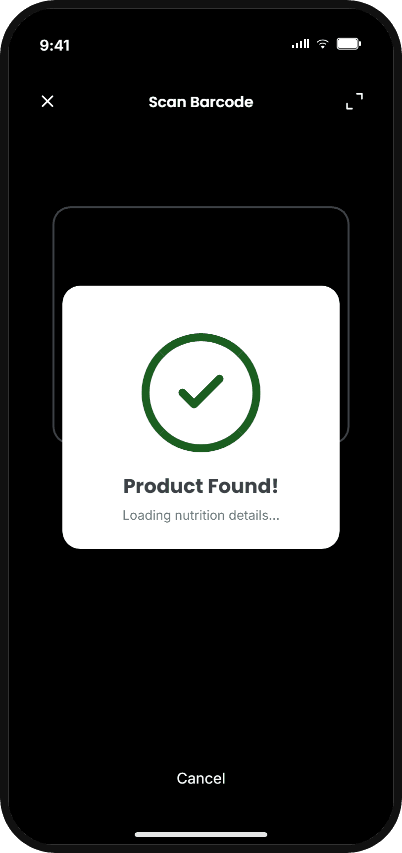
Score, category and a clear 'avoid / swap' signal on one screen

Post-scan action path — the moment the scan-to-action gap closes

Ultra-processed warning shown alongside the score

{02} — Smart Swaps

Healthier alternatives at the moment of decision — not three scrolls away.

Smart Swaps above the fold, immediately after scanning

Each alternative shows the specific nutritional improvement

Side-by-side comparison of the two products

Add a swap to the shopping list in one tap

{03} — Barcode-first entry

Barcode-first, three steps — from 4.2 minutes to 2.5.

Barcode scanner as the primary input, not a buried feature

Nutrition data pre-populated from the scan

Week 3
Progression State Screen

Three steps, not seven — one decision per screen

Manual search available as a fallback

Week 12
Mastery State Screen

{04} — Accessibility & edge cases

Designed for the users the original app couldn't reach.

Scanner feedback state — haptic, auditory and visual at once

Clear pathway
(not permanent setback)

Every interactive control has a screen-reader label

Actionable error state — not a generic "Product not found"

IMPACT & RESULTS

IMPACT & RESULTS

IMPACT & RESULTS

Faster. Accessible. Used.

40
40
40
40

Feature discovery success rate

Up from 40% in Think Aloud baseline. The behaviour-change feature is now the second tap from the home screen.

Up from 40% in Think Aloud baseline. The behaviour-change feature is now the second tap from the home screen.

Discoverability

0
0
0
0

Screen reader task completion

Up from 0% on the original scanner. Every user can now complete a scan through three simultaneous feedback channels.

Accessible

0
0
0
0

Reduction in food entry time

From 4.2 minutes to 2.5. The step-4 drop-off — 60% of all abandoned sessions — was eliminated.

Users chose reflection question over monitoring

Faster

3.2 → 1.1

Re-scan attempts per item

The scanner always worked. After the redesign — haptic pulse, auditory tone, visual state change — users finally knew it had. Screen-reader completion on the same interaction went from 0% to 100%.

Original — database-first4.2 min
Search
Category
Select
Confirm nutrition↓ 60% abandoned here
Quantity
Review
Submit
Redesign — user-first2.5 min
Scan
Confirm
Log

The three feedback channels, confirmed

The redesign — three simultaneous signals
Redundant by design · WCAG 2.1 SC 1.3.3
Haptic
A short pulse confirms the camera has captured the barcode.
For sighted users with hands full, or in a noisy aisle
Auditory
A single soft tone — toggleable for public spaces.
For low-vision users, and anyone not looking at the screen
Visual
The scanner frame shifts white → green with a confirmation overlay.
For deaf users, and users with sound off

The original app scored 2.2 out of 5 on Perceived Value Beyond Labels — whether users could do anything useful with what they scanned. The redesign targeted the exact cause: not data quality, not scanning speed, but the absence of any guidance architecture between the scan and the decision. Each metric above measures one gap closed.

— From the evaluation conclusion

Users chose reflection question over monitoring

REFLECTIONS

REFLECTIONS

What designing for vulnerability taught me about designing for everyone.

Fixing the symptom is faster. Fixing the cause is the job.

  • Search fixes a discoverability symptom. Removing screens fixes a length symptom. Neither touches the structure. The question before any iteration: are we changing the structure, or the appearance of the structure?

Accessibility constraints made the design better for everyone.

  • A confirmation legible to a screen reader is legible to any distracted, hands-full user. Screen-reader completion went from 0% to 100% — and the quieter win is that sighted re-scans dropped from 3.2 to 1.1.

A simulated environment is not a shopping environment.

  • Think Aloud ran in a controlled room with real products. It surfaced genuine failures — but not the cognitive load of a parent scanning while managing a child in a busy aisle on poor signal. The next round of evidence has to come from where the app is actually used.

A structured method doesn't just surface problems. It proves they're real.

  • Three evaluators, standardised templates, independent assessment, a consolidation step to resolve disagreement — 22 findings with defensible severity ratings. That rigour is how the catastrophic issue got caught: a single-pass audit would have rated it "major".

The redesign didn't add data quality or scanning performance. It added the guidance architecture between the scan and the decision — the exact gap the 2.2/5 "Perceived Value Beyond Labels" score measured.

What I'd do differently

  • Test the scanner feedback and navigation in a real supermarket — dim light, time pressure, genuine distraction, patchy connectivity — the conditions a controlled session can't reproduce. And run a dedicated pass with screen-reader users beyond the initial sample.

AI INTEGRATION

Where I used AI — and where the stakes were too high to.

AI IN MY PROCESS

  • Structured the case-study narrative and stress-tested how the evidence connected to each decision

    Checked the argument against the principles of senior portfolio presentation

    The research — heuristic evaluation, Think Aloud testing, severity rating — was conducted without AI

    Rule applied: AI organises and articulates genuine findings; it does not generate them

  • WHAT AI DID NOT TOUCH

    The 22 findings came from three evaluators assessing a real interface against a structured framework

    Six participants navigated real tasks on their own devices — no AI tool replicates that

    The value of those findings is that they came from direct contact with the product and with users

    Rule: a finding comes from fieldwork; AI never stands in for a user session or an evaluator

WHERE THE STAKES WERE TOO HIGH

  • Every design decision in the Figma prototype was made by hand, informed by evidence and tested against WCAG criteria

    The annotation language describes mechanisms, not features — deciding what to name, what to emphasise, what to leave out

    Every published figure was checked against the evaluation record before it went on the page

    That judgment — what to name, what to emphasise, what to leave out — is the design

FUTURE AI OPPORTUNITIES

  • ML-powered product recognition to identify items the barcode database misses

    A visible confidence score when the model is uncertain — "Is this the right product? 85% confident"

    Ethical constraint: the app surfaces the healthier choice, never the sponsored one

    Rule: AI must serve the health decision, not engagement