
Overview
Fly Far. Learn Fast.
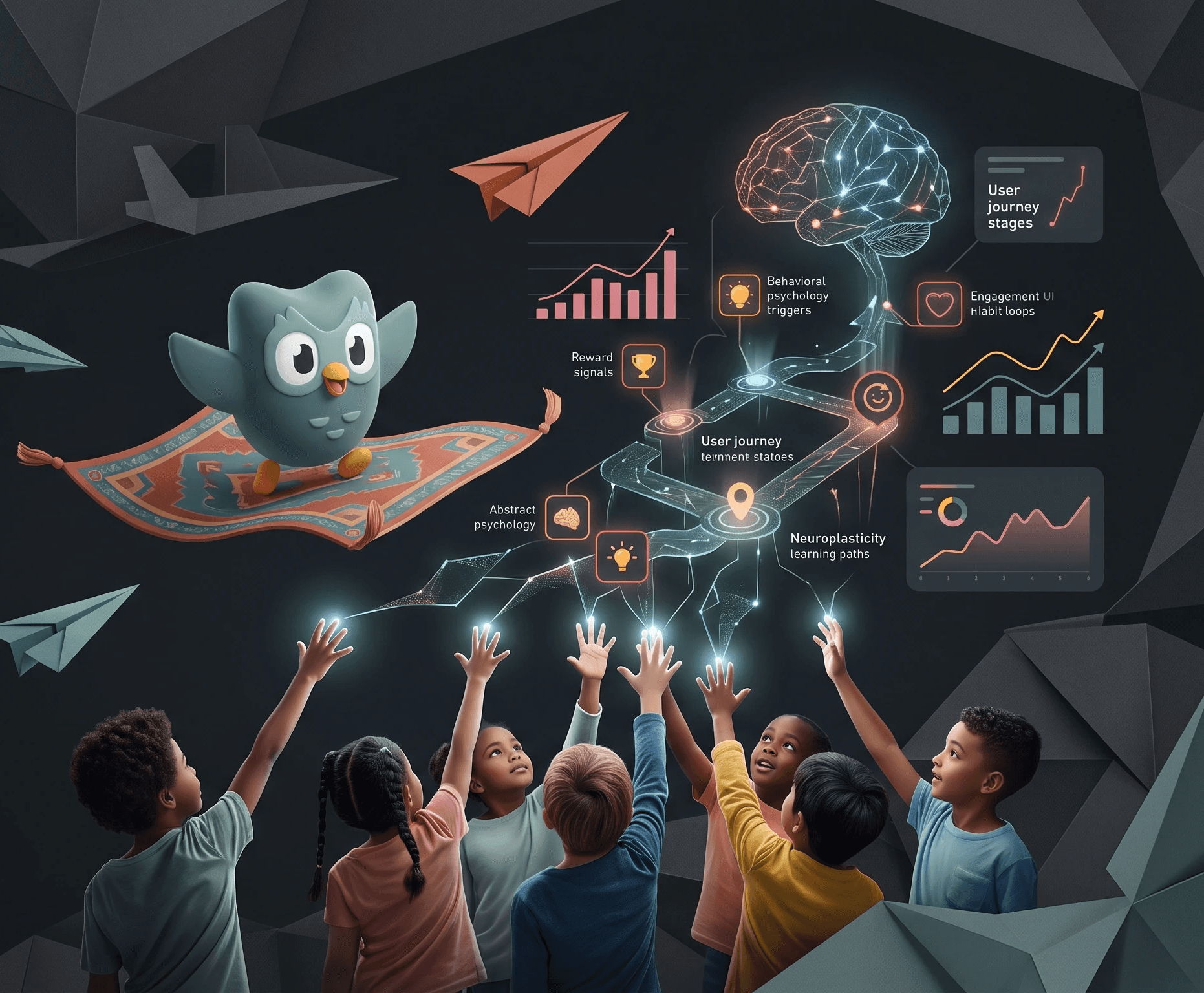
A campaign concept for Duolingo, one visual metaphor designed to convert a child; aged five to eleven, and their parent at the same time, without treating them as one audience.

My contribution
Creative Director
I developed the campaign concept, design direction, and all the visual assets.
Status
A proposal against the brief, never commissioned or launched
Opportunity
Free users were dropping off exactly where the app asked them to pay.
The brief described free-tier users hitting a wall at the heart limit and the ad break;
the precise moments designed to drive conversion, and leaving.
Feature-led messaging ("unlimited hearts," "no ads") wasn't creating enough emotional pull to justify payment. The brief set a target of converting 15% of free-tier users to premium within three months, against an 11.2% baseline.
Three constraints made the brief genuinely difficult:
A dual audience (children use the app; parents pay for it)
A minor-facing product that needed data-ethics thinking built into the creative rather than added afterwards
A fixed budget that ruled out brute-force channel spend.
6 yrs
The peak window for natural language acquisition; declines gradually after this, and drops sharply past age 12, from paediatric language-development research, not a marketing framing
£1.25 bn
Spent by UK households on back-to-school tech in 2024,
from a 2024 survey of UK parents on back-to-school tech spending
Why the Summer Window; Age Advantage & Back-to-School Spend
Idea
Duolingo's worst emotional moments were its conversion moments. I reframed the friction instead of hiding it.
Running out of hearts, hitting an ad, these are the app's least pleasant instants, and they're exactly where it asks a family to pay.
My response makes the friction itself the story:
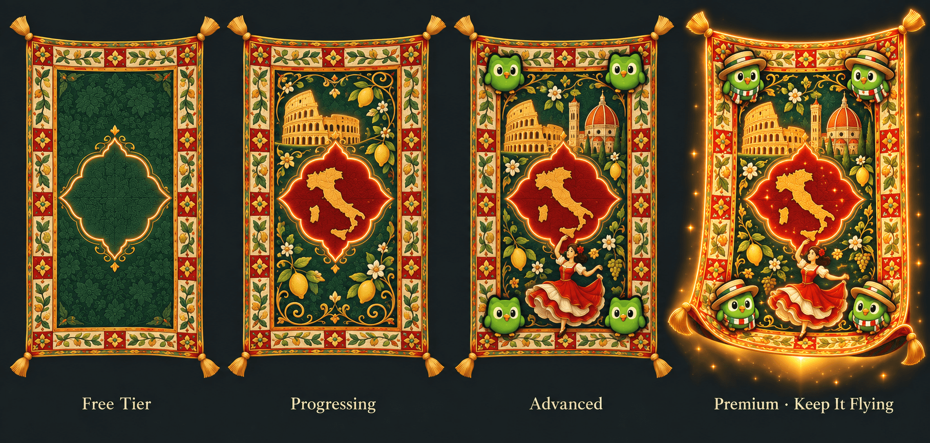
The Magic Carpet is a single evolving object that visibly grows more detailed with every lesson, so language progress, normally invisible, gets a physical form. Running out of hearts becomes "the carpet losing altitude." Premium becomes "keep it flying."
I tested this against four other directions before settling on it. None of the others held up against three questions:
Does progress become visible?
Does premium get a story instead of a feature list?
Does the idea work for a five-to-eleven-year-old and a parent at once?

The Carpet as Progress System; Four Mastery Stages
Four stages of mastery made visible. Progress accumulates as pattern; premium extends the pattern rather than removing a restriction.
"Each lesson adds to your carpet. Where will your next word take you?"
Visual identity
One palette, one pattern logic; so nothing had to be redrawn between an app icon and an airport banner.
The carpet had to work as a repeatable graphic idea, not a single illustration. Five colours do the same job on every carpet and every screen: gold linework holding the pattern together, one shared red medallion at the centre regardless of country, Duolingo's own green carried through as the brand anchor, a warm parchment cream behind every card for legibility, and a deep charcoal night that lets all of it glow.
Antique Gold
Linework, borders, CTAs
Heritage Red
The shared medallion mark
Duolingo Green
Brand anchor, app icon
Parchment Cream
Card backgrounds, legibility
Charcoal Night
Backdrop for every carpet
Duolingo green is kept deliberately, not replaced, the campaign borrows the brand's existing credibility rather than competing with it.
Spain
France
Germany
Italy
Four fields, one system
Each country keeps its own base colour underneath the shared gold, red and charcoal above; a controlled variation, not a separate palette per market.
The same promise stays identical everywhere it shows up: learning takes you somewhere, and progress becomes something you can point at. Colour and altitude do most of the talking. A carpet that's stalled reads as paused, one that's climbing reads as keep going.
The app icon, hero banner and all four country carpets shown together as one system.

The pattern language follows the same logic as the mastery diagram: it has to read at 64 pixels and at six metres without losing the construction that makes it recognisably a carpet.
I designed it as a modular vector system from the outset, not a static illustration, so the same geometry that sits inside an app icon could scale up as an airport installation without being redrawn.

Campaign
One metaphor. Two audiences who need to hear entirely different things.
A child doesn't engage with a statistic about language acquisition, and a parent won't convert on "magic" alone. The visual system stays identical across every touchpoint; the copy voice splits cleanly by who's reading it.
Child; User
"Design your magic carpet and explore new worlds."
• Every lesson adds a new pattern to the carpet
• Fly higher as more languages are learned
• Collect small rewards for streak days
Primary channels:
YouTube Kids · in-app
Parent; Decision-maker
"Give your child the language-learning advantage of the summer window."
• Higher language-learning capacity at this age
• Turns summer screen time into a measurable activity
• Progress both parent and child can actually see
Primary channels:
Instagram · TikTok · Email
Instagram carousel; the carpet-transformation sequence
Designed for a minor-facing product, not just a funnel.
The same discipline that split the copy by audience also split what each audience is asked to do. A child is never the one asked to pay.
Child-facing
Every cue speaks about lessons and altitude; never money, urgency, or a countdown.

Parent-facing
Anything that collects a child's information sits behind a parental checkpoint; no tracking runs ahead of that consent.

"The measure of a good minor-facing design isn't how well it converts a child; it's how little it needs to."
The same carpet, redrawn for every touchpoint the brief needed.
I owned the creative execution across every proposed channel; from a 30-second animated narrative down to a single push notification. Consistency mattered more than novelty: the pattern on a phone screen had to be recognisably the same object as the one on a banner.
Inside the app: the carpet becomes the interface
The metaphor didn't stay in marketing; it became the actual progress screen. Home carries the carpet at its current stage instead of a generic bar, the language path is laid out as carpet waypoints rather than a numbered list, and finishing a level closes with a certificate that keeps the same visual language instead of switching to a generic badge.
Onboarding, home, journey map and certificate; shown here in Spanish. French, German and Italian follow the same construction, right down to the carpet reappearing on the certificate itself.
YouTube Kids; Pre-roll
An animated story: a child discovers the carpet, finishes a first lesson, and watches it transform. Placed by context only, never by tracking. No behavioural targeting runs on children's content.
Email nurture
A parent-facing sequence tied to premium, named "Your Child's Magical Journey Begins," shown here as it will actually look in an inbox.

In-app notification
Triggered when hearts run out. The carpet tilts and loses altitude, and the copy treats the limit as part of the story, not a wall. It's a deliberate choice: people are generally more moved to avoid losing something than to gain something new.

TikTok
Same transformation, cut down for TikTok's faster pace.
Offline: the airport activation
A proposed weekend activation at UK airports, timed to peak summer travel, the one moment a family is simultaneously in a "learning mindset" and has nothing else to do. Four physical elements, each bridging back to the app by QR code:
Microsite
The one part of this project that's real, live, and still online.
Everything else here is a proposal. The microsite isn't, I built and published it myself, with approval, on Netlify with custom HTML, CSS and JavaScript. Because the product is aimed at children, privacy-first defaults shaped the build from day one: no tracking ahead of consent, and a parental step in front of anything that collects a child's information.
Measurement
Modelled against the brief; not a single number to defend.
The proposal modelled outcomes against the brief's own £50,000 budget assumption. None of the figures below are measured results; the campaign was never run. They're either the brief's stated target or my own projection against it, shown as a range rather than one headline number.
Conversion rate, in context
Modelled ROI; Conservative to Optimistic, Against a £50,000 Budget
£26.14
Modelled cost per acquisition
vs. £50+ category average
8,725
Modelled premium conversions
Moderate scenario
£523K
Modelled Year-1 revenue
On the £50,000 media investment
Let's
design
build
create
Something Impactful