
Easy to use. Not worth using.
My Role
UX designer;
from evaluation to redesign
Built for
Health-conscious shoppers and people managing a dietary restriction
Timeline
6 weeks · 2025
The app's job is to change what goes in the basket
Food Scanner is part of the NHS Better Health campaign. Parents, health-conscious shoppers and people with dietary needs scan a barcode, see the sugar, fat and salt, and find a healthier swap. The scan is only the start. The swap is the point.
64%
£6.1bn
1,250+
The scan worked. Everything after it didn't.
{01} — Problem
The app had the data.
It never gave a verdict.

{02} — Problem
Every scan led to a dead end.
The feature that could change behaviour was invisible.

{03} — Problem
The scan worked. The result never reached the people who couldn't see it.
The strategic breakthrough
The closer people got to a better choice, the more they failed.
I watched people use the app to shop for healthier food. Scanning went fine. Every step after it got harder.
Six Think Aloud sessions with real products in a mock shop: a parent, a teenager, a teacher, a nutritionist, someone with gluten intolerance and an older adult managing diabetes. Alongside them, an expert review of the app, 1,250+ app store reviews, and a look at how Yuka, Open Food Facts and FoodSwitch handle the same moments.
Key insight
The badge said "Good Choice."
The nutrition said otherwise.
The badge judged sugar, salt or fat one at a time, so ultra-processed products earned it too.
Led to:
A plain verdict in place of the badge, with a clear next step.
Silence felt exactly like failure
With no signal during capture, people re-scanned the same product 3.2 times on average, just to check it had worked.
Led to:
Touch, sound and a visible confirmation at the moment the barcode is caught.
The most useful feature was the hardest to find.
Smart Swaps sat behind a swipe on the result screen. Only one of six participants found it without help.
Led to:
Smart Swaps on the result screen, and a tab bar with five sections.
Users read the numbers.
They had no idea what to do next.
Five of six participants stopped after the scan, including the nutritionist. They rated the app 2.2 out of 5 for telling them more than the packet did.
Led to:
Three places people got stuck, three changes
{01} — Decision
Put the next step where the scan lands.
Only one of six people found healthier swaps without help. Getting from a scan to a better choice meant leaving the result, guessing which section held the alternatives, then digging. I put "Find Healthier Alternatives" and "Compare Products" on the result screen, above the fold. The verdict and the next step now share one screen.
Advice was even harder to reach: people found it in only 30% of attempts. Now a "Learn more" link sits on every result, and short guides on sugar, salt and labels have their own tab.
Led to:
4.2 → 2.5 min from a scan to a healthier choice, in the redesign test.


{02} — Decision
Let people compare without rescanning.
All six participants tried to compare two products, and all six struggled.
They had to remember one result, scan the next and hold the numbers in their head.
I added a side-by-side comparison, one tap from any alternative, with the healthier option marked for each nutrient.


{03} — Decision
Make the numbers mean something.
Results now show each nutrient as a share of the daily limit, with a plain warning when something is high. A clear Per 100g / Per portion switch sits at the top, and the "Good Choice" badge became a grade that also shows how processed the food is.


What this proves
The same goal, two architectures. The original made users leave the result screen and hunt for the next step, and lost most of them on the way. The redesign puts the verdict and the next action in the same place. The database didn't change; the user's journey stopped being a maze.
Three moments where the quick fix wasn't enough
{01} — Discovered in Think Aloud testing
The answer to a hidden feature isn't search. It's structure.
Features sat one guess deep. Healthier swaps hid behind a swipe, and "My lists" was really a scan history.
On detail screens the tab bar disappeared, and on long pages the back button scrolled out of view, so people felt stuck. A user even tried search to find healthier options, and still needed a hint.
/
Rejected; Put every feature in one menu
A menu button on every screen, listing Smart Swaps, Compare, My lists and Settings. Quick to add, and nothing is more than two taps away. But a menu hides features behind another tap, so people still have to know what they're looking for.
/
Shipped; Five tabs in view, and a way back from everywhere
Home, Scan, My Scans, Learn and Progress, each one tap from anywhere. "My lists", which was really a scan history, became My Scans. Every detail screen has a back button in the same place.


{02} — Discovered in heuristic evaluation + reviews
A better error message was still a dead end.
Missing products were the top complaint in the reviews:
58% of negative mentions.
When a barcode wasn't in the database, the app showed "Product not found" and a Close button.
Dim light and weak signal led to the same dead end.
/
Rejected; rewrite the error message
Friendlier, more specific, low effort. But a clearer dead end is still a dead end. Someone holding the product still had no way to reach its nutrition.
/
Shipped; give the failed scan somewhere to go
The error now says why the scan failed and what to do next. Product not found: try again, search by name or add it.
Too dark: turn on the torch, now a button on the scanner.
No signal: a downloaded list of common products keeps scanning working offline. Barcode not clear: Try again or enter barcode manually.


{03} — Discovered in Think Aloud testing
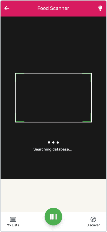
The original app beeped, vibrated and showed a "Barcode detected" tick when it caught a barcode, but showed nothing while it was scanning and never said what it had found. In earlier testing, 38% of people scanned the same product more than once.
/
A loading indicator, plus labels so the phone's screen reader can read the result. But it appears after the barcode is caught, and the doubt comes earlier. Screen readers only help people who already use one, so children still heard nothing.
/
Shipped; Show the scan working, then say what it found
A moving scan line and "Scanning…" while the camera looks. A tick and a vibration still confirm the moment it catches. Then voice narration reads out the product and its ratings, for people who can't see the screen and children who can't yet read labels.


Try the redesigned app
Faster to a decision. Usable by everyone.
What a mock shop couldn't tell me
Fixing the symptom is faster. Fixing the cause is the job.